
![The Most Common Leadership Styles & How I Found Mine [Expert Insights]](https://www.hubspot.com/hubfs/leadership-styles-4.jpg)
![PowerPoint Tips to Present Like a Pro [Expert Advice & Free Templates]](https://www.hubspot.com/hubfs/powerpoint-design-tricks_7.webp)


.png)


Responsive Web Design Guide: Create Websites That Fit Every Screen
Responsive web design is now a cornerstone of a successful online presence. As mobile devices dominate internet usage globally, including in Australia, businesses must ensure their websites are accessible, functional, and visually appealing across all screen sizes. A poorly optimised website could mean losing potential customers, especially in competitive markets. This guide is made for […]

Responsive web design is now a cornerstone of a successful online presence. As mobile devices dominate internet usage globally, including in Australia, businesses must ensure their websites are accessible, functional, and visually appealing across all screen sizes. A poorly optimised website could mean losing potential customers, especially in competitive markets.
This guide is made for Australian business owners and marketers leveraging responsive web design to enhance user experience, improve SEO rankings, and future-proof their websites. From its principles to actionable strategies, this guide will help you create websites that fit every screen.
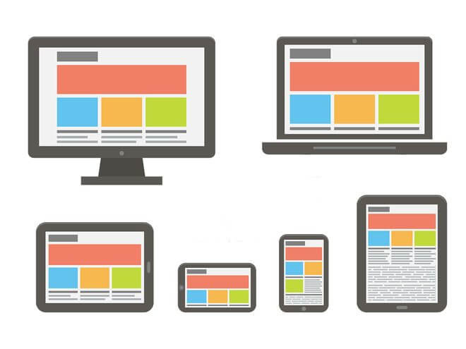
What Is Responsive Web Design?
Responsive web design ensures that websites are visually appealing and functional across all devices, screen sizes, and orientations. This approach uses flexible grids, scalable media, and CSS media queries to create layouts that adapt seamlessly to desktops, tablets, and smartphones. Unlike static designs, Responsive Web Design eliminates the need for separate websites for different devices, streamlining maintenance and enhancing user accessibility.
By prioritising user experience, Responsive Web Design enables easy navigation and readability, regardless of the device. Whether someone is browsing on a large desktop monitor or a compact smartphone screen, responsive design ensures that the layout, images, and text adjust dynamically to fit perfectly. This adaptability improves usability, reduces bounce rates, and fosters engagement.
Responsive design is essential for search engine optimisation (SEO). Google’s mobile-first indexing rewards mobile-friendly websites with higher rankings, making Mobile Responsive Web Design a critical factor for online visibility. It also supports faster loading times and better Core Web Vitals performance, key metrics for user satisfaction.
Businesses adopting Responsive Web Design benefit from future-proofing their websites as technology evolves. Responsive web design by accommodating various devices and screen resolutions ensures a consistent and professional online presence, strengthening brand credibility and maximising reach in an increasingly mobile-first digital world.
The Evolution of Responsive Web Design
Ethan Marcotte pioneered the concept of responsive design in 2010, but its origins can be traced back to the need for better usability during the mobile internet boom in the 2000s. Websites designed only for desktops were difficult to navigate on smaller screens, leading to frustration and lost traffic.
- Early Days: Websites were static and fixed-width, making them incompatible with mobile devices.
- The Breakthrough: Media queries and flexible grids transformed web design, allowing dynamic layouts.
- Today’s Responsive Web Design: Advanced tools like CSS Grid, Flexbox, and responsive frameworks simplify the development of fluid websites.
Australian Success Stories
Leading Australian brands like Qantas and The Iconic showcase stellar examples of responsive design. Their websites provide seamless experiences, whether users browse on a smartphone, tablet, or desktop, highlighting the competitive edge of Responsive Web Design in the local market.
Why Responsive Web Design Matters
Mobile Internet Usage in Australia:
Australia boasts one of the highest mobile internet penetration rates globally, with over 90% of its population accessing the web through mobile devices. Ignoring this trend can alienate a significant audience segment, particularly younger demographics who depend on smartphones for shopping, research, and entertainment. A mobile responsive web design ensures businesses remain relevant and accessible, catering to this increasingly mobile-first consumer base.
User Experience (UX):
Responsive design is a cornerstone of excellent user experience. It ensures that website content is easily readable, navigable, and interactive, no matter the device. Features like intuitive navigation menus, adjustable layouts, and scalable images not only enhance user satisfaction but also significantly reduce bounce rates. When users can seamlessly engage with your website, they’re more likely to stay longer and convert into customers.

SEO Advantages:
Search engines, particularly Google, prioritise mobile-friendly websites. With its mobile-first indexing, Google evaluates websites primarily on their mobile versions. A responsive design improves performance on Core Web Vitals metrics such as:
- Loading performance: Faster page load times enhance user retention.
- Interactivity: Smooth, responsive interactions encourage engagement.
- Visual stability: Prevents content shifting, improving overall usability.
- Business Credibility: A well-designed responsive website conveys professionalism and reliability. Users associate seamless browsing experiences with brands that care about their audience. By ensuring your website works flawlessly on any device, you build trust, encourage repeat visits, and strengthen your brand’s credibility.
Key Principles of Responsive Web Design
- Flexible Layouts: At the heart of responsive web design (Responsive Web Design) are flexible, percentage-based grids. Unlike fixed-width layouts, these grids allow elements to adjust proportionally based on the screen size.
For instance, a column that occupies 50% of the screen will maintain that proportion, whether viewed on a smartphone, tablet, or desktop. This adaptability ensures a visually harmonious experience across all devices.
- Media Queries: CSS responsive web design media queries enable developers to tailor website styles for different screen sizes and resolutions. By defining specific design rules for various devices, media queries ensure a cohesive visual experience. For example, using the following code snippet:
CSS
@media (max-width: 768px) {
.container {
padding: 10px;
}
}
This change ensures optimal spacing and layout on smaller screens like tablets, improving usability without compromising design integrity.
- Flexible Media: Images and videos in responsive designs must resize seamlessly without distortion. By applying CSS properties such as max-width: 100%, media elements adapt to their container sizes while preserving their aspect ratios. This prevents awkward cropping or stretching, ensuring visuals look professional on any device.
- Content Prioritisation: Responsive design emphasises a content-first approach, focusing on delivering essential information upfront. This approach is especially beneficial for users on smaller screens, allowing them to quickly locate key information without unnecessary scrolling. By prioritising content effectively, businesses can improve user engagement and satisfaction.
Step-by-Step Guide to Creating Responsive Websites
1. Planning Phase
- Understand Your Audience: Analyse the devices your target audience uses most frequently.
- Content-First Approach: Develop content that addresses user needs before considering layout.
- Wireframing and Prototyping: Create a blueprint of your website using tools like Adobe XD or Figma.
2. Design Phase
- Adopt a Mobile-First Strategy: Start by designing for smaller screens and scale up for larger devices. This ensures core functionality works seamlessly across all platforms.
- Responsive Tools: Use design tools like Sketch or Canva to visualise layouts dynamically.
3. Development Phase
- CSS Frameworks: Leverage frameworks like Bootstrap, Foundation, or Tailwind CSS to simplify development.
- Media Queries: Write efficient queries to target specific breakpoints.
- Flexible Grids and Images: Implement CSS properties that allow automatic resising of elements.
4. Testing Phase
- Tools for Testing: Use platforms like BrowserStack or Google’s Mobile-Friendly Test to evaluate performance.
- Avoid Pitfalls: Ensure no fixed-width elements disrupt layouts. Also, test on a range of devices, including older models.
Best Practices for Responsive Web Design
- Accessibility: Creating an inclusive website ensures a broader audience can engage with your content. Adhering to Web Content Accessibility Guidelines (WCAG) is a crucial step. Features such as adding descriptive alt text to images and enabling keyboard navigation to improve usability for users with disabilities and enhance overall accessibility.
This approach not only reflects a commitment to inclusivity but also boosts SEO by making content more accessible to search engines.

- Image Optimisation: Optimising images is essential for faster website load times, especially on mobile devices. Tools like TinyPNG or ImageOptim compress images without compromising quality, reducing file sizes significantly. This ensures users experience quicker page loading, even on slower connections, which can improve user retention and Core Web Vitals scores.
- Scalable Graphics: Using Scalable Vector Graphics (SVGs) for icons and logos guarantees crisp visuals across all screen resolutions. Unlike raster images, SVGs remain sharp and clear when scaled, providing a professional appearance on both small mobile screens and large desktop displays.
- Progressive Enhancement: Designing with progressive enhancement means building a core experience tailored to low-powered devices first. Advanced features and functionalities are then layered for high-end devices, ensuring all users enjoy a smooth experience, regardless of their hardware or browser capabilities.
Responsive Web Design Trends
- Dark Mode Compatibility: With the growing popularity of dark mode, many users now prefer it for reducing eye strain and conserving device battery life. Incorporating dark mode into responsive web design improves user satisfaction. Developers can utilise CSS media queries to detect a user’s preferred color scheme:
CSS
@media (prefers-color-scheme: dark) {
body {
background-color: #000;
color: #fff;
}
}
This approach ensures a seamless transition between light and dark modes, enhancing user experience.
- Fluid Typography: Dynamic typography is an essential trend in responsive design. Using units like vw (viewport width) for font sizes, text can automatically scale based on the device’s screen size.
For instance, a headline set to font size 5vw will adjust proportionally, maintaining readability across devices from smartphones to widescreen monitors.
- CSS Grid and Flexbox: CSS Grid and Flexbox have transformed layout design, allowing developers to create complex, responsive layouts with minimal effort.
These tools eliminate the need for excessive code and provide more control over alignment and spacing. For example, CSS Grid excels in building multi-column layouts, while Flexbox is ideal for aligning elements within a container.
- Performance Optimisation: Responsive web design isn’t just about adaptability—it also focuses on performance. Techniques like lazy loading ensure images are loaded only when they are about to appear on the screen, reducing initial page load times.
Similarly, asynchronous scripts allow non-essential code to load in the background, keeping the main content accessible without delay.
Breakpoints for Responsive Web Design
Breakpoints determine when a layout should be adjusted for optimal viewing. Here are common breakpoints:
- Small Devices (320px–480px): Smartphones.
- Medium Devices (481px–768px): Tablets.
- Large Devices (769px–1024px): Laptops.
- Extra-Large Devices (1025px+): Desktops.
Custom breakpoints may be required for specific industries, like retail, to cater to unique device usage patterns.
Common Challenges and Solutions in Responsive Web Design
- Handling Complex Navigation: Creating intuitive navigation on smaller screens is a persistent challenge. Menus that work seamlessly on desktops often appear cluttered or overwhelming on smartphones, frustrating users and increasing bounce rates.
The solution lies in simplifying navigation by using responsive design techniques like hamburger menus or collapsible dropdowns. These compact options keep the interface clean while allowing users to access all key pages effortlessly.
Additionally, developers can implement touch-friendly navigation with larger tappable areas to improve usability on mobile devices.
- Balancing Aesthetics and Functionality: Striking the right balance between design and usability is vital. While visually appealing designs can attract users, overly intricate layouts might hinder navigation and slow download times.
The solution is to adopt a minimalist approach that prioritises user engagement. A clean, uncluttered layout emphasises functionality while ensuring that aesthetic elements support, rather than distract from, the user experience.
Developers can use whitespace effectively to enhance readability and focus attention on critical content.
- Browser Compatibility: Ensuring consistent performance across different browsers is a technical hurdle for responsive web design. Elements that look flawless in one browser might render poorly in another due to differences in how browsers interpret code.
To tackle this, developers should rigorously test their designs using cross-browser tools like Responsinator or BrowserStack. These platforms simulate various browsers and devices, helping identify compatibility issues early.
Using standardised coding practices and modern frameworks like Bootstrap also enhances consistency.
Tools and Resources for Responsive Web Design
Frameworks
- Bootstrap: Offers pre-designed responsive components.
- Tailwind CSS: Provides utility-first CSS for rapid customisation.
Design Tools
- Figma: Great for collaborative prototyping.
- Adobe XD: Ideal for creating interactive wireframes.
Testing Tools
- Google Lighthouse: Evaluates performance and accessibility.
- BrowserStack: Simulates testing across multiple devices.
Australian businesses can also benefit from accessibility compliance tools tailored to local regulations.
Conclusion
Responsive web design isn’t just a technical necessity—it’s a competitive advantage. By creating websites that deliver consistent, seamless experiences across devices, Australian businesses can capture and retain their audience’s attention. Whether you’re a marketer looking to improve engagement or a business owner aiming to boost conversions, investing in mobile responsive web design is the key to staying relevant.
If you’re unsure where to start, consider partnering with a web development company specialising in responsive web design. With the right tools, strategies, and professional guidance, your website can become a powerful asset in the digital landscape.
FAQs
What Are the Five Golden Rules of Web Designing?
Mobile-First Approach: To prioritise essential content, begin designing for smaller screens first, then scale up for larger devices.
Simple Navigation: Clear and intuitive menus help users quickly find what they need, reducing frustration.
Fast Loading Speed: Optimised code and compressed media improve site performance, especially on mobile networks.
Accessibility Compliance: Websites should adhere to WCAG guidelines, ensuring inclusivity for all users.
Consistency Across Devices: Maintain a cohesive look and feel, regardless of the device used to access the site.
What Are the Principles of Responsive Web Design?
At its core, responsive design is built on flexible layouts, media queries, and scalable media. Together, these principles create a cohesive, user-friendly experience on devices of all sizes, enhancing usability and accessibility for diverse audiences.
What's Your Reaction?