


.png)


The Power of the Button: Elevate Your CTAs to Increase Conversion Rate
Call-to-action (CTA) buttons are more than just clickable elements on your website; they’re essential tools that guide user behavior and increase conversion rates. Whether it’s encouraging a purchase, prompting a download, or inviting users to subscribe, a strategically designed CTA can make the difference between a casual visitor and a loyal customer. Optimised CTAs have […]

Call-to-action (CTA) buttons are more than just clickable elements on your website; they’re essential tools that guide user behavior and increase conversion rates. Whether it’s encouraging a purchase, prompting a download, or inviting users to subscribe, a strategically designed CTA can make the difference between a casual visitor and a loyal customer.
Optimised CTAs have a direct and measurable impact on conversion rates, making them a cornerstone of any effective digital marketing strategy. This guide dives deep into the world of CTAs, offering actionable strategies to elevate their effectiveness. By the end, you’ll have all the tools and insights to craft CTAs that engage users and boost your bottom line.
What Are CTAs and Why Are They Crucial for Increasing Conversion Rate?
A call-to-action (CTA) directive encourages users to take a specific action. These buttons or links act as digital nudges, guiding users toward the next step in their journey. From “Sign Up Now” to “Shop the Sale,” CTAs are pivotal in driving user engagement.
The Role of CTAs in Conversions
The Impact of Optimised CTAs
Statistics underscore their importance:
Personalised CTAs generate a 202% better conversion rate than generic ones.
Colour and design optimisations alone can boost click-through rates by up to 42%.
Key Elements of a High-Converting CTA
Creating a high-performing CTA involves focusing on several key elements:
1. Placement
Strategic positioning ensures that CTAs are visible and accessible. Effective placements include:
- Above the fold: Ideal for capturing immediate attention.
- End of blog posts: Encourages users to take the next step after consuming content.
- Within compelling content: Seamlessly integrates CTAs to align with user intent.
2. Design
A visually appealing CTA grabs attention. Consider:
- Contrasting colours: Stand out from the page background.
- Appropriate size: Large enough to notice but not overpowering.
- Shapes: Rounded edges or uniquely designed buttons create visual interest.
3. Copy
CTA text must be concise and compelling. Use action-oriented language that highlights benefits, such as:
- “Download Your Free Guide”
- “Start Saving Today”
4. Urgency
Phrases like “Limited Time Offer” or “Only 2 Days Left” instill a sense of urgency, motivating immediate action.
5. Clarity
Ambiguity reduces clicks. Ensure the CTA communicates what users will gain. For example, “Learn More About Our Features” is more compelling than “Learn More.”
How to Align CTAs with Your Target Audience
Every stage of the buyer’s journey requires tailored CTAs:
- Awareness stage: Focus on education. Example: “Discover More.”
- Consideration stage: Offer solutions. Example: “Explore Our Features.”
- Decision stage: Drive action. Example: “Buy Now.”
Adapting Tone and Design
Different demographics respond to unique tones and designs:
- E-commerce: Vibrant colours and casual tones work well. Example: “Shop the Trend.”
- B2B services: Professional tones and minimalist designs resonate. Example: “Schedule Your Free Demo.”
Real-World Examples
A fitness app targeted millennials with “Start Your Free Trial Today,” using bold fonts and dynamic imagery. In contrast, a financial services firm used “Secure Your Future – Get a Quote” with subtle tones and clean design for a more mature audience.
Advanced Techniques to Boost CTA Performance
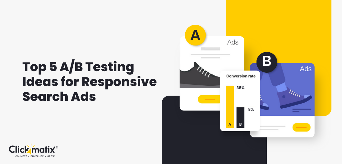
1. A/B Testing
Experimenting with variations of CTAs is crucial. Test:
- Colors: Red vs. green buttons.
- Copy: “Try It Free” vs. “Get Started Today.”
2. Placement
Sidebar vs. end-of-content.
3. Personalisation
- Dynamic CTAs tailored to user behaviour can dramatically increase engagement. Examples:
- Showing “Welcome Back! Explore New Arrivals” to returning users.
- Displaying location-specific offers, such as “Shop the Best Deals in Sydney.”
4. Social Proof Integration
Including reviews, testimonials, or trust badges near CTAs builds credibility. For example, “Join 10,000+ Satisfied Customers” reassures users before they click.
5. Mobile Optimisation
With mobile traffic dominating, ensure CTAs are:
- Responsive: Adapts to different screen sizes.
- Thumb-friendly: Large enough to tap without difficulty.
Common CTA Mistakes to Avoid
1. Generic or Vague Text
One of the most common pitfalls in CTA design is using uninspiring, generic phrases like “Click Here” or “Submit.” These fail to convey value or urgency, leaving users unsure about what they’ll gain by clicking. Specific, action-oriented language is far more effective. For example, instead of “Click Here,” opt for “Download the Ultimate Guide” or “Start Your Free Trial Today.” These phrases clearly outline the benefit and encourage action, increasing engagement. Always focus on aligning the CTA text with the user’s intent and the value they’ll receive.
2. Overcrowding the Page
Cluttering a page with multiple CTAs can confuse users and dilute their effectiveness. When presented with too many options, users are less likely to take action, a phenomenon known as decision paralysis. To maintain focus, limit each page to one primary CTA and, at most, one secondary CTA that complements the main goal. For example, a product page might prioritise “Add to Cart” as the primary CTA while offering “Learn More” as a secondary option.
3. Poor Design
A CTA that blends into the background fails to capture attention. Effective CTAs stand out with contrasting colours, bold fonts, and sufficient white space around them. For instance, a brightly coloured button like orange or red against a neutral background can significantly improve visibility and click-through rates. Ensure the design is not only eye-catching but also aligns with your brand identity for consistency.
4. Lack of Follow-Through
A common mistake is failing to fulfill the promise of the CTA. When users click “Learn More,” the landing page should offer comprehensive and relevant information, not sparse or unrelated content. This disconnect can frustrate users, erode trust, and decrease future engagement. To enhance user experience and increase conversion rates, ensure your CTA aligns with a clear, valuable, and consistent post-click journey.
Measuring the Impact of Your CTAs
Tracking Performance is Critical for Refining CTA Strategies
Understanding how your CTAs perform is essential for improving their effectiveness. Without tracking key metrics, you risk missing opportunities to enhance user engagement and boost conversions. By regularly analysing data, you can uncover actionable insights that drive better results.
- Click-Through Rate (CTR): This metric shows the percentage of users who click on your CTA compared to the total number of visitors. A high CTR indicates that your CTA is capturing attention and sparking interest.
- Conversion Rate: This measures how many users complete the intended action after clicking the CTA, such as signing up for a newsletter or making a purchase. It’s a direct indicator of your CTA’s ability to influence user behaviour.
- Engagement Rate: Tracks user interactions with content surrounding the CTA, such as hovering, scrolling, or clicking, providing additional context for user intent.
Tools for Analysis
Platforms like Google Analytics, Hotjar, and Crazy Egg offer detailed insights into CTA performance. Heatmaps, session recordings, and user flow tracking help pinpoint areas of improvement.
Interpreting Data
Analyse trends to identify what works. For example, if “Get Started Now” achieves higher engagement than “Start Today,” use similar language across other CTAs. Continuous testing and adaptation ensure your CTAs stay effective and relevant.
Conclusion
Call-to-action (CTA) buttons may be small, but their impact on increasing conversion rates is immense. By optimising placement, design, copy, and personalisation, you can create CTAs that engage users and deliver results. Avoid common mistakes, implement advanced strategies, and consistently monitor performance to maintain a competitive edge.
Ready to take the next step? Boost Your Conversion Rate Today – Contact Us! Partner with a top SEO agency in Melbourne and see your websites soar!
What's Your Reaction?