25 Top-Notch Product Landing Page Templates
Over the course of my career as a marketing executive, I’ve found that an effective product landing page template can be a vital resource. After all, a landing page is a great way to turn traffic into conversions — but not all pages are created equal.

Over the course of my career as a marketing executive, I’ve found that an effective product landing page template can be a vital resource.
After all, a landing page is a great way to turn traffic into conversions — but not all pages are created equal.
In this article, I’ll start by going through a number of product landing page examples, exploring the wide range of templates you can use to get started crafting your own landing page today.
Then, I’ll offer some of my favorite, tried-and-true best practices for creating a winning landing page.
25 Free Professionally-Designed Landing Page Templates
Ready to get started? Below, I’ve compiled a list of 25 of my favorite free, professionally-designed landing page templates that you can use to build your next landing page. So, let’s dive in!
1. Royce
Available on Squarespace
Royce is a template designed specifically for event reservations. It doesn’t include a navigation bar, sticking to a clean layout that features a customizable background image, a headline, and a call-to-action (CTA) button that says “RSVP.”

What I like: To fill out the form and reserve a spot, visitors can either click the RSVP button to see a form appear or simply scroll down below the fold to see a static reservation form, offering visitors two ways to convert.

2. Click Through
Exclusively Available With HubSpot’s Free Landing Page Builder
The Click Through landing page template is ideal for capturing blog subscribers.
It includes an attractive hero image at the top, space to provide context about what users can expect if they subscribe, and a module for past content right below.

Pro tip: This template can also be customized with your brand and edited with HubSpot’s drag-and-drop interface.
3. Simple Conversion
Available on HubSpot
This design includes a photo, customizable text, and a short form. It has no navigation bar, keeping visitors focused on your offering, and you can also customize and add other elements, such as the icons below the form.
Below the fold, you can also add more information about your offering or company.

Best for: This template is a great option if you’re looking to add some custom elements to your landing page.
4. Blank
Available on HubSpot
The Blank template has a simplistic look and feel, but it devotes a bit more room to text than some of the other templates on this list. As such, Hubstrap might be a good option if your content offer doesn’t need as much imagery.
For example, you might use this page to describe an offer, such as a long whitepaper on a topic related to your industry. As with other templates, you can also personalize the design and add drag-and-drop sections to the page.

What I like: Unlike the landing page templates above, this example does include a navigation bar. However, it’s simple enough that it doesn’t distract from the offer, making this a great option if you’re looking to include navigation.
5. Video
Exclusively Available With HubSpot’s Free Landing Page Builder
If you don’t want your conversion elements at the top of the page, a longer-form sales page might be your best bet. Video is a modern, minimalist-looking template that you can customize with your detail-rich sales copy.

Pro tip: Pairing each section of text with a compelling video is a great way to create a user experience your prospects will love.
6. Session
Available on HubSpot
This template includes a hero image, a headline, text, bright CTA buttons, and a form. I love how it eliminates the navigation bar but still includes a button at the top of the page.
The image keeps information visible but less distracting. As you scroll below the fold, this template also includes places for more imagery and details that could relate to your product or offering.

Best for: The single button at the top of the page makes this template a great option for marketers looking to direct visitors’ attention directly to a CTA.
7. Focus
Available on HubSpot
Focus is a sleek, modern design for a content-based offer. It has a simple layout with a form, headline, description text, photo, and logo, and as with many of the other templates I’ve shared, it has no navigation element.
I especially like how this template enables you to add a photo or product shot. I also like the bright background that keeps me engaged.

Pro tip: For extra customization, this template allows you to adjust or change the color of the background.
8. University
Available on Wix
I’d recommend this layout for marketers seeking leads for an educational event, course, or similar service.
The form is more detailed than some of the other templates on this list, and the layout itself also allows room for more text and imagery.
Above the fold, you can see a headline, supporting images, and a form. Then, if you keep scrolling down, there are additional sections where you can place even more text and imagery.

What I like: This template includes some great components specifically designed for educational offerings.
9. Skyline
Available on Wix
This template is a good option for a company or individual that hasn’t yet launched their website or product but still wants to gain some leads in the meantime.
Above the fold, there’s a giant headline area with the text “Coming Soon.”
When you scroll down, you can see a place for a short description of the company and a box where visitors can add their email. In addition, this template also lets you add a photo or video to the background.

Best for: If you’re promoting an offering that isn’t yet available, Skyline is definitely a great template to consider.
10. Sprocket
Exclusively Available With HubSpot’s Free Landing Page Builder
With a big headline, a short subtitle, and a conversion element above the fold, Sprocket helps you make your point concretely and succinctly.
This makes it a great landing page for nearly any piece of gated content, from ebooks to newsletters and tools.

What I like: Sometimes, less is more. This template doesn’t have too much going on, and that makes it one of my favorite options for a clear, straightforward offering.
11. Online Store Coming Soon
Available on Wix
This template is very simple. Like the “Coming Soon” template I shared above, this template allows you to edit the text, so you can use this layout for a range of different purposes.
There is no navigation element, and information about the company is off in the corners, keeping the prime real estate of the page clear and focused.
This layout includes space for a strong product shot (in the example below, it’s an image of a pair of shoes), as well as headline text, a small amount of descriptive text, an email box, and a CTA button.

Pro tip: This template also lets you link your social media accounts to the icons under the “Notify Me” button.
12. Lead-Gen Landing Page
Available on Wix
In my experience, this template is especially effective for B2B products. It allows you to edit and customize the text and images, as well as enabling you to place background videos into the layout.
The page is designed to be on the longer side, with a form and CTA above the fold, followed by sections that can detail different aspects of your company, such as staff information, below.

Best for: If you’re focused on B2B offerings, I definitely recommend taking a look at this template.
13. Proland
Available on Envato Elements
This template has a little more going on than some of the other ones I’ve shared, but I think it’s a great option for marketers looking to include some more detailed information alongside their CTA.
The template includes a minimal navigation bar, a headline and subtitle, and a button you can use to launch a video.
Envato does require a paid subscription to access this template, but it offers a 30% discount for students and unlimited downloads once you become a member.

What I like: With its clean design and minimalist aesthetic, this is a great template for a modern brand looking to share some more details about its offering.
14. Atlas
Exclusively Available With HubSpot’s Free Landing Page Builder
Specifically designed for ebooks, Atlas establishes a simple format to help your website visitors visualize the offer, digest what it’s about, and convert above the fold.
If they need more information — for example, if you’re offering an in-depth white paper or report — additional modules can be added to further persuade them to opt in.

Best for: I’ve found that Rally is an especially effective template for landing pages promoting an ebook or similar content offering.
15. Real Estate Landing Page
Available on Wix
The focus of this template is to invite visitors to contact the company. While it doesn’t offer a resource for information by default, it can be edited and customized to include such an offering.
In addition, as you scroll down the page, the background image remains static, and there is room to add company information below the fold.

Pro tip: You can use the second form at the very bottom of the page to give visitors another chance to convert.
16. Construction and Lawyer Landing Pages
Available on WordPress.org
While the Lawyer Landing Page and Construction Landing Page templates target two different industries, their designs are very similar. Both have a header image, overlaid text, and an arrow pointing to a decently sized form above the fold.
Furthermore, both these templates have a place to offer visitors a free quote.

What I like: Although these templates are designed for the legal and construction fields, they can easily be customized to fit other brands and industries.
17. Accelerator
Exclusively Available With HubSpot’s Free Landing Page Builder
Another landing page that combines versatility with a flexible layout, Accelerator is a great option if you want to create a gripping narrative around your copy.
This template gives you plenty of room to provide additional context about your offering before presenting visitors with a conversion element, and you can also add extra modules with its simple, drag-and-drop interface.

Best for: This template can be adapted for either long-form content or short, snappy, hard-hitting copy.
18. Gardenhouse
Available on MailChimp
This template does not include a navigation bar, which ensures that your visitors will be focused on your offering and CTA. In addition, like all landing page templates from MailChimp, this layout is optimized for mobile.
That means it will automatically adjust to different screen sizes — a feature that I’ve found especially important in recent years, as more and more traffic comes from mobile devices.

Pro tip: You can customize this template with your company’s logo and/or other company information toward the bottom of the page.
19. Bandmates
Available on MailChimp
This template is also pretty simple, but it’s got plenty of room for customization.
As with many of the other templates I’ve highlighted, it has no navigation bar, but it does have space for a company logo, text description, and a subscribe form above the fold.
With Bandmates, you can also drag more elements, like text or form boxes, into the design. In addition, just below the form, you can include either a product shot or another image.

What I like: The default blue background allows the form and CTA button to pop, but you can also customize the colors to fit your brand.
20. O-Book
Available on Unbounce
Unbounce requires a subscription, but you can test out layouts like O-Book for a free, 14-day trial period.
As such, this template would be a good option for a company that has already gained revenue from existing landing pages and is looking to test out a more detailed (though still affordable) design.
This template includes a clear spot for a product image, headlines, and detailed description text as well as a form box to collect visitors’ contact information.
In addition, O-Book’s top navigation bar is minimal, but it does include social media buttons.

Best for: This template is designed for lead generation specific to ebooks, making it a great option for marketers looking to promote a longer-form content offering.
21. Webinar
Available on Wix
This template is specifically designed for marketers looking to promote a webinar or similar event-based offering.
With its limited navigation elements and prominently displayed headline and CTA, this is a great option if you’re looking for a more minimalist approach.

Pro tip: Below the fold, this template has space for you to add some more detail about the event, including background information and a testimonial.
22. Essex
Available on Squarespace
This template is another fun, minimalist option. Essex has no navigation bar. Instead, it includes a single, brightly colored CTA at the top corner of the page.
It includes a massive heading and image above the fold, as well as space for more details if you scroll down the page.

What I like: I especially love the unique color schemes available with this template, from its default purple and green to a range of additional options you can choose from.
23. Marketing Launch
Available on Wix
Another solid option for promoting an offering that is not yet available, the Marketing Launch template is a sleek yet engaging layout.
It includes space for a prominent headline, a box to collect visitors’ email addresses, and a full-page background image or video.
At the bottom of the page, this template includes small social media icons, keeping viewers focused on the main CTA in the center of the page.

Best for: I’ve found that simple landing pages like this one can be a great way to build excitement about an offering that’s still “coming soon,” while also enabling you to collect contact information from potential customers.
24. Product Landing Page
Available on Wix
This brightly-colored template is one of my favorite layouts from Wix. Starting off with a short headline and CTA, this template keeps the CTA front and center.
Scrolling down past the fold, it includes a series of panels with different colored backgrounds, ensuring that the information and pictures pop while consistently directing viewers toward CTA buttons.
Finally, at the very bottom of the page, there’s a place where you can add social media links, as well as a box to collect visitors’ email addresses.

Pro tip: In my experience, fun imagery and colors like the ones included in this template are a great way to keep visitors engaged.
25. Consultant Landing Page
Available on Wix
This template is specifically designed to help consultants promote their business and gather contact information from prospective customers.
While many of the other templates in this list start off with a lot of imagery or videos, this template keeps it clean with a plain background, headline, and simple “Let’s talk” CTA above the fold.
If you scroll down, the template includes space to present a short bio, an overview of services provided, and a carousel to display some testimonials. Then, at the very bottom of the page, there’s a short contact form.
Sticking to its minimalist principles, this form includes text boxes for just a first and last name, an email address, and a message.

What I like: This template sets itself apart with its innovative highlighter animation effect, instantly drawing visitors’ attention to the main headline at the top of the page.
Landing Page Best Practices
The templates above illustrate many important landing-page best practices. For example, many of the templates I’ve listed have no navigation bar, as a navigation bar can detract attention or clicks away from the offer on the page.
Most of them also have room for a photo or video, which are great ways to boost engagement.
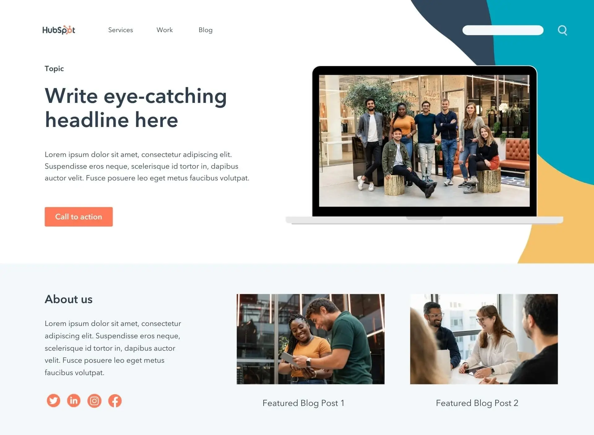
An effective landing page offers visitors a helpful resource, such as a white paper, exclusive video, or other piece of content, in exchange for their contact information. For instance, take a look at this landing page example from HubSpot:
This page starts off with a place to add an eye-catching headline and featured image. It also includes a prominently displayed CTA, which can be used to link to a contact information form.
It offers space to describe the content offering with enough detail to entice viewers without bogging them down in unnecessarily lengthy text.
In fact, this example landing page illustrates several critical best practices to keep in mind when designing your own pages:
- Avoid complexity. Landing pages are important, but they don’t have to be complicated. Aim for a page that’s concise and inviting rather than complex and overwhelming.
- Don’t ask for too much. Rather than just placing a long contact form on your page, tease an interesting offer or a free resource in exchange for just a small amount of contact information.
- Leverage AI. Generative AI tools like HubSpot’s Campaign Assistant can help you quickly write your first draft, getting you up and running in minutes.
- Embrace templates. Finally, even if you know what you’re going to offer and what information you’d like to receive from visitors, building a landing page from scratch can feel daunting. So, if you don’t have the bandwidth to build a page yourself, and if you don’t have the resources to hire a designer, using a pre-designed website template can be a great way to launch a professional-looking page quickly and effectively.
To learn about other landing page best practices, check out this comprehensive guide.
Craft the Best Landing Page for Your Business
At the end of the day, every business is different. The best landing page for one organization may be utterly ineffective for another — and vice versa.
But armed with the templates and best practices I’ve shared in this article, you’ll be on your way to crafting the best landing page for your unique company, offering, and customers.
Editor’s note: This post was originally published in May, 2019 and has been updated for comprehensiveness.
![]()
What's Your Reaction?


![Why You Should Leverage Interactive Videos [Data from 500+ Marketers]](https://www.hubspot.com/hubfs/interactive-video-1-20250216-406926.webp)

![Which LLM Should You Use for Your Business? [Pros and Cons]](https://www.hubspot.com/hubfs/which%20llm%20to%20use.png)

















.png)


