


.png)


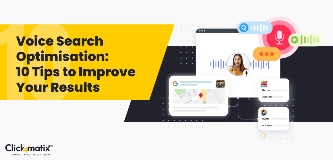
The Power of the Button: Elevate Your CTAs and Boost Conversions
What Is A Call To Action Button? Call-to-action buttons hold incredible power on your page or site. It is a conversion button that urges readers to take action on a website, blog, or any form of communication. It invites your targeted audience to complete the intended goals you have in mind. The most used CTA […]

What Is A Call To Action Button?
Call-to-action buttons hold incredible power on your page or site. It is a conversion button that urges readers to take action on a website, blog, or any form of communication. It invites your targeted audience to complete the intended goals you have in mind. The most used CTA buttons in everyone’s vocabulary are – Buy, Add to Cart, Know More, Subscribe, and more. Yet, there’s no limit to how creative CTA buttons can be. The list is endless! Good CTAs guide users through your marketing funnel, giving your website users clear instructions on what to do next. Together with other website elements, like social proof and customer reviews, CTAs are key to transforming leads into customers.
You can use CTA buttons in various areas on a website and your landing pages. For instance, you can place them on your homepage, blog pages, offer subpages, forms, or pop-ups.
Some common types of website call-to-action buttons include add-to-cart, download, and free trial registration buttons. You can use CTA buttons to get your website visitors to do other things, too. For example, if you want to gain Instagram followers, you would place a ‘Follow Us To See More,’ or a similar CTA. You can have Subscribe, Sign Up, or Join CTAs as well, depending on your page’s goal.
You will find that there are many call-to-action button designs you can use. Yet, you should be strategic about choosing your designs. Depending on your goal conversion and your website style, buttons can differ in colour, style, and size. To ensure results, your site’s CTA has to be clear and should stand out. Call-to-action buttons are your most important tool for encouraging prospects to perform a certain action that inches them closer to conversion, which is the ultimate goal of marketing. It is the quickest way for visitors to become potential customers.
Importance of Effective Call to Action Button
Effective CTAs play a crucial role in improving the conversion rate of your website. They guide your visitors towards taking the desired action. Whether it’s making a purchase, signing up for a newsletter, or downloading a resource, a well-crafted CTA can increase the likelihood of conversion. By communicating the value proposition and providing a clear directive, CTAs reduce friction in the user journey, making it easier for visitors to engage with your content and become customers.
Types of Call-to-Action Buttons
There is a wide range of call-to-action buttons that you can use to engage your audience and drive conversions. Some of the most effective types include:
Buy, Shop, Order, Reserve, Save, Add to Cart, Pick, View:
These buttons are used to prompt visitors to make a purchase or sign up for a service.
Try, Free trial, 30 days free, Sign up for FREE:
These buttons offer visitors the opportunity to try out a product or service before committing to a purchase.
Subscribe, Join, Sign Up, Refer:
These buttons encourage visitors to become part of a community or sign up for regular updates.
Download, Get, Grab, Claim:
These buttons offer visitors access to valuable resources or exclusive content.
Learn More, See More, See How, Start, Find Out, Check it Out, Click Here, Continue, Swipe Up:
These buttons provide visitors with extra information or encourage them to explore further.
The Top CTA Optimisation Tips:
Match CTA Intent with Landing Page Intent:
Aligning the intent of your Call-to-Action with that of your landing page is crucial for conversion optimisation. If a user clicks on a CTA expecting one thing and is directed to a landing page offering something different, it creates a disconnect and reduces the likelihood of conversion.
Studies have shown that consistent messaging between CTAs and landing pages can increase conversion rates. For instance, a study by HubSpot found that matching CTA messaging with landing page content increased conversions by 55%.
Understanding your target audience and their needs is key to ensuring alignment between CTA intent and landing page content. Conducting thorough market research and analysing customer feedback can provide valuable insights into what resonates with your audience.
Use Strong and Contrasting Button Colors:
The colour of your CTA button plays a significant role in attracting attention and encouraging clicks. Choosing colours that stand out from the rest of the page can make your CTA more appealing and increase its effectiveness.
Research has shown that certain colours can evoke specific emotions and influence consumer behaviour. For example, red is often associated with urgency and excitement, while green conveys a sense of safety and trust.
According to a study by the University of Winnipeg, using a contrasting colour for your CTA button can increase conversion rates by up to 14%. Additionally, a study by HubSpot found that red and green CTAs outperformed other colour conversion rates.
Play with Words:
The text used in your CTA button can make a significant difference in its effectiveness. It’s important to choose words that are clear, concise, and action-oriented to encourage users to take the desired action.
Research has shown that certain words and phrases are more persuasive than others. For example, using words like “free,” “limited-time offer,” or “exclusive” can create a sense of urgency and encourage immediate action.
A study by WordStream found that using first-person pronouns (e.g., “my” or “me”) in CTAs can increase click-through rates by up to 90%. Additionally, using strong verbs that convey action (e.g., “download,” “subscribe,” “buy”) can make CTAs more compelling.
Get the Spacing Right:
The spacing and placement of your CTA button can have a significant impact on its visibility and effectiveness. It’s important to ensure that the button is well-balanced and stands out from surrounding elements on the page.
Research has shown that proper spacing around a CTA button can increase its visibility and make it more noticeable to users. A study by Nielsen Norman Group found that increasing the whitespace around a CTA button by 20% can increase conversion rates by up to 20%.
It’s also important to consider the layout and design of your landing page when positioning your CTA button. Placing it in a prominent location where it’s accessible to users can improve its performance.
Make it Interactive:
Adding interactive elements to your CTA button can make it more engaging and encourage users to take action. This can include animations, hover effects, or other dynamic elements that capture users’ attention.
Research has shown that interactive CTAs can increase engagement and conversion rates. A study by MarketingSherpa found that adding animation to CTAs increased conversion rates by up to 30%.
It’s important to strike a balance between interactivity and usability when designing CTAs. While interactive elements can be attention-grabbing, they should not detract from the clarity and functionality of the button.
Placement of the CTA Button:
The placement of your CTA button on the landing page can impact its visibility and effectiveness. It’s important to place the button in locations where it’s likely to be noticed and clicked by users.
Research has shown that placing CTAs above the fold (i.e., in the top part of the page) can increase visibility and engagement. A study by Nielsen Norman Group found that CTAs placed above the fold received 84% more views than those placed below the fold.
Additionally, it’s important to consider the flow of the landing page and place CTAs in locations where they fit within the user journey. For example, placing CTAs at the end of product descriptions or blog posts can encourage users to take the next step.
Clickable Design:
The design of your CTA button plays a crucial role in its effectiveness. It’s important to choose a button style and shape that is recognisable and clickable for users.
Research has shown that certain button styles and shapes can perform better than others’ click-through rates. For example, rounded buttons are often perceived as more clickable and appealing than square buttons.
It’s also important to consider the colour, size, and placement of your Call to action button when designing it. A study by ConversionXL found that using contrasting colours for the button and surrounding elements can increase click-through rates by up to 75%.
Mobile-friendly Button:
With the increasing use of mobile devices for browsing and shopping, it’s essential to ensure that your call-to-action buttons are mobile-friendly and optimised for smaller screens.
Research has shown that mobile-friendly CTAs can impact conversion rates. A study by Google found that 61% of users are unlikely to return to a mobile site they had trouble accessing, and 40% will visit a competitor’s site instead.
It’s important to design CTAs with mobile users, considering factors such as button size, spacing, and placement. Testing CTAs on different devices and screen sizes can help ensure a consistent and optimised user experience.
Dual CTA:
Including many CTAs on your landing page can cater to users at different stages of the buying journey and increase the likelihood of conversion.
Research has shown that offering many CTAs can increase engagement and lead to higher conversion rates. A study by Unbounce found that landing pages with multiple CTAs generated 266% more leads than those with a single CTA.
When using dual CTAs, it’s important to differentiate between them and provide relevant options for users. For example, you could offer one CTA for immediate purchase and another for more information or a free trial.
Make Your CTA Button Meet Your Visitors More Often:
Understanding how users navigate and interact with your landing page can help you place CTAs where they’re most likely to be noticed and clicked.
Research has shown that users tend to follow predictable patterns when scanning web pages, such as the F-pattern or Z-pattern. Placing CTAs in areas where users’ eyes gravitate can increase visibility and engagement.
Additionally, using visual cues such as arrows or images can draw attention to CTAs and encourage users to take action. Testing different placements and designs can help determine the most effective approach for your specific audience and goals.
Your Click-Through Result Should be Clear:
After clicking on a CTA, users should be directed to a landfill-to-action that delivers on the promise made in the CTA. It’s essential to ensure that the next steps are clear and intuitive to avoid confusion or frustration.
Research has shown that providing a seamless user experience after the click can impact conversion rates. A study by Adobe found that 39% of users will stop engaging with a website if images take too long to load or if the layout is unattractive.
It’s important to match the messaging and design of your landing page to that of your CTA to maintain consistency and reinforce the user’s decision to click.
Create Urgency:
Creating a sense of urgency in your CTA can encourage users to take immediate action and increase conversion rates. This can be achieved through language that emphasises scarcity or time-sensitive offers.
Research has shown that urgency can be a powerful motivator for action. A study by Cialdini et al. found that scarcity and urgency tactics can influence consumer behaviour and increase sales.
It’s important to use urgency tactics ethically and transparently to avoid misleading users or damaging your brand reputation. Limited-time offers or inventory alerts can create urgency without resorting to manipulative tactics.
Supporting Text with the CTA Button:
Providing additional context or information alongside your CTA button can help clarify the offer and increase its effectiveness. This can include a brief description of the product or service being offered, as well as any relevant benefits or features.
Research has shown that supporting text can improve the clarity and persuasiveness of CTAs. A study by Nielsen Norman Group found that adding descriptive text alongside a call to action button increased conversion rates by up to 20%.
It’s important to keep supporting text concise and relevant to avoid overwhelming users or distracting them from the main call to action. Use language that reinforces the value proposition and encourages users to take the next step.
Stick to First-person Narration:
Using first-person language in your CTAs can create a more personal and engaging experience for users, increasing the likelihood of conversion. This can involve addressing the user and emphasising their control over the decision-making process.
Research has shown that first-person pronouns (e.g., “I,” “me,” “my”) can increase engagement and click-through rates. A study by MarketingExperiments found that using first-person language in CTAs resulted in a 90% increase in click-through rates compared to second-person language.
It’s important to tailor your language to the specific needs and preferences of your target audience. Testing different variations of CTAs can help determine which approach resonates best with your users.
Heat Maps for Optimisation:
Heat maps can provide valuable insights into user behaviour and help optimise the placement and design of your CTAs. By visualising where users are clicking and how they’re interacting with your landing page, you can make data-driven decisions to improve conversion rates.
Research has shown that heat maps can uncover patterns and trends that are not immediately clear from traditional analytics data. For example, a study by Crazy Egg found that only 20% of users scroll past the fold on most web pages, highlighting the importance of placing CTAs strategically.
It’s important to use heat maps in conjunction with other tools and techniques, such as A/B testing and user feedback, to gain a comprehensive understanding of user behaviour. By monitoring and optimising your CTAs, you can maximise their impact and drive better results for your business.
Conclusion:
Mastering the art of landing page call-to-action buttons is essential for improving conversion rate optimisation strategies and driving business growth. By understanding the importance of effective CTAs, exploring different types of CTAs, and implementing best practices for CTA optimisation, you can create compelling CTAs that drive results. Partner with a top SEO agency in Melbourne and see your websites soar!
What's Your Reaction?